I guess the simplest solution would be to make it appear as if there were windows there, as so many other buildings do. Most buildings don't make you say, "oh, there is where the elevator shafts are", even if they share an exterior wall. You seem very defensive here...I apologize if you had something to do with this design and take pride in it....but I don't think I am the only one here who sees a pretty bland boxy building in the renderings. The window patterns make it look a little better in real life than I thought, that is all. But I am glad we can go over this 3 times:)
PS, maybe they did it to reference their neighbor by the river...that is a tower with a giant blank wall, probably where the elevator shafts are too. Mostly kidding, but I just realized these buildings have that in common.
Text doesn’t convey tone very well. I’m not defensive. Only trying to get some depth to the critique.
I have no issue with criticism of any architecture if it has depth. Saying something is terrible is not constructive or creating much space for a conversation about design, development, or planning. Every building has some things that aren’t as good as they could be. And it is worth discussing, but it takes more than empty judgement.
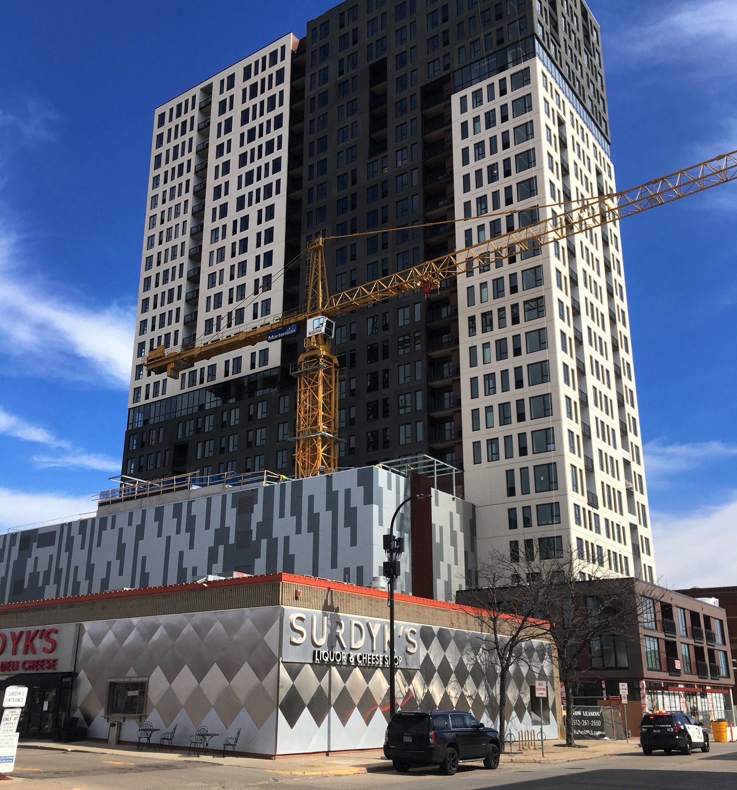
As far as this particular building, the elevator was surrounded by shear walls (a common occurrence) and installing spandrel glass windows would have been difficult to waterproof. The elevator core could have been moved inward on the building (this would be the solution I’d opt for if it was an option) but that probably negatively effects parking and interior circulation. So the solution as it is, while not ideal, probably was the only option given all the circumstances. This is often the case for buildings, particularly those with tight development budgets (as opposed to civic or institutional buildings that can, if absolutely needed, raise more money or increase budgets).